
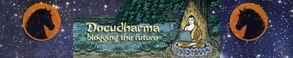
Here’s the old idea from Magnifico and myself:
I messed with this some.
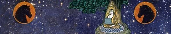
Same thing with no landscape. The words would need to be dropped back in by someone.
Full size. I needed a new starfield and don’t have full-size horses, so someone would need to drop them in.
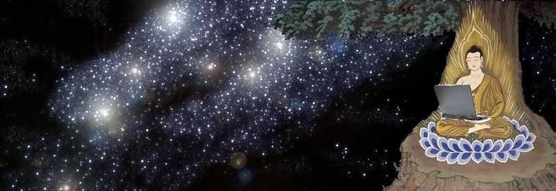
Same thing with laptop:
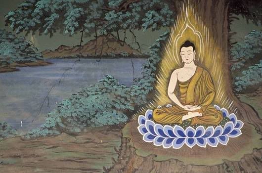
Now, raw material so you can play with this. Man and tree with white background to drop onto stuff like starfields (this was the hardest part! There seems to be no way to make save the white edges completely “color clean” — there is some very light grey scattered — you need to clean it when you drop the image):
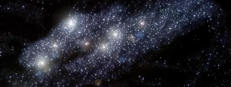
Starfield, easy enough to find another one if you don’t like this one:
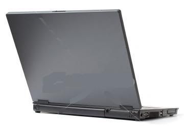
And laptop, needs to be shrunk:
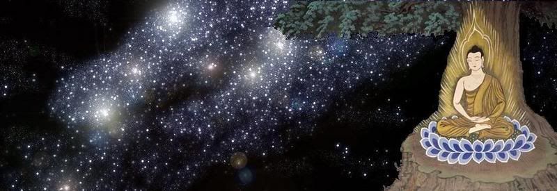
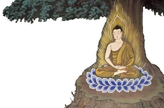
Oh, and here’s the original tree and buddha image:
I hope this is helpful!
53 comments
Skip to comment form
Author
I like it with no landscape. Gotta see it with the writing to really get it, maybe can’t accommodate so contrasty a nightsky but I totally dig the basic idea.
see my comment here:
http://www.docudharm…
Until buhdy gets back he wants to go with something like the image you have on the top. WITHOUT THE PONIES. I’m leaving work right now. I have the original starfield from OPOL and I will post the link to it when I get home. I was hoping you could recompose the image using the fonts and Magnifico’s original piece. I would do it but I’m kind of busy with the rest of the stuff that needs to get done around here.
Is the original buddha/tree fair use?
Meanwhile you are also welcome to play with the design and let buhdy see what you come up with. I’m not trying to stifle the creativity. This is all good stuff.
I *don’t* like the landscape with starfield. The blue-green doesn’t work with the blue-purple, and the stars and pastoral scenes are too discordant. Choose one.
One thing to consider if you drop the ponies is to make one of them an emblem on the top of the laptop, which might be sort of wry. You’d have the skew the image, of course.
makes the current color scheme look great!
But don’t fall in love too fast.
Tonight I’ll try green, but I think I’ll skip pink (not because it’s too girly, but because I think it makes you look like a candy cane).
Author
Move the sleeping Buddha down almost to (or all the way to) the border, move the horse to the right, and put it behind (but jumping over) the calves of the Buddha. You might need another geegaw to the left to balance it out, but this would be a fun effect.
I’ve sprung an eek!
Banner! Colors! Font! Oh, my!
Is there an end to this artistic madness?
Pen of Fire Blue is rgb(25,50,255) and I might be inclined to do something more like upper lefty, but a little brighter.
I will put better comments on the attributes and colors. I’m not sure which setting controls the font size in the diaries. Have you figured that out?
What do you think of using the shades of gold for links (#C37F34) and visited links (#E8B34B) and/or the Diary Titles?
LC, love your rendition of buddha in the heavens against the tree w/laptop… great LC
but i think i like the drama of OPOL’s banner for us and this is what i would ask OPOL if we can try this:
use LC’s sky, your buddha, wi/john walking away, the black keyboard (maybe a little more faint or something)
as for the left side, use more readable font for docudharma and find chinese horse to photoshop there instead of eyes… or use constellation pegasus & make lines to see the horse or use acutal pegasus
it gives buhdy the horse… the chinese style would work with the design… and maybe he can change that one element as he likes
don’t box in the name or horse… or try just boxing in name
anyway… but love your concept OPOL