2011 marks the sesquicentennial of the start of the American Civil War. On New Year’s Day 150 years ago, South Carolina had already seceded from the United States and the next months would see ten more states secede from the Union, the inauguration of Abraham Lincoln, the formation of the Confederate States of America, and the start of the war.
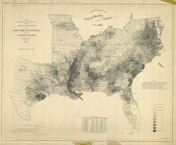
Historian Susan Schulten wrote about the 1860 Census and map showing American slavery in The New York Times last month. The United States Coast Survey used the 1860 Census data, the last time the federal government counted the slave population, to produce two maps illustrating slave population – one of Virginia and the other of the entire South.

The map depicts each county’s slave population, with “the darker the shading, the higher the number of slaves”, which is a “visually arresting way to see the range of slavery across the South without having to read a single data point,” she writes. It was popular with President Lincoln and the American public after its publication. It was sold throughout the war “for the benefit of the sick and wounded soldiers.”

 America
 )
)